Update: Effective as of January, 10, 2017, Google is punishing mobile sites with “intrusive interstitials” aka pop-up ads. The consequences come in the form of lowered SEO ranking in search results. To find out what qualifies as an interstitial that makes content less accessible (and will therefore be punished) check out Google’s official blog.
“Responsive web design (RWD) is an approach to web design aimed at allowing desktop webpages to be viewed in response to the size of the screen or web browser one is viewing with.” – Wikipedia definition
RESPONSIVE WEB DESIGN
So what the heck is responsive web design, and why is it so important? In the past, multiple website used to be built in order to accommodate different screen sizes. A responsive web design means you have a single website, whose layout and content adapts across screen sizes. Your website therefore, can be viewed seamlessly across all screens – desktops, laptops, tablets and mobile.

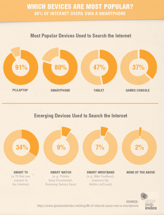
With mobile technology continuously advancing and more and more people accessing the internet via their mobile devices, you want to ensure your website visitors have the best experience possible no matter how they access it. The better a user’s experience is, after all, the more likely they will make return visits to your site.
IS YOUR SITE RESPONSIVE?
If you are using KartHost’s™ EZWP Builder WordPress package, then congrats! Your site is 100% mobile-friendly & 100% responsive! Basically it is guaranteed for your website to look great across any screen size. Not sure if your site is mobile friendly? Take the Google test.
According to marketing research company, MicKinsey & Company, Google reports 61% of users are unlikely to return to a mobile site if they had trouble accessing it. Furthermore, 83% of mobile users say that a seamless experience across all devices is very important – Salesforce.
GOOGLE & THE “MOBILE FIRST” PUSH
If the above stats haven’t convinced you to use a responsive web design, then maybe Google can you persuade you. Did you know, Google actually punishes you if your website is not optimized for mobile devices in the form of lowering your site’s SEO ranking in searches?
In 2015, Google began using mobile-friendliness as a ranking signal in search results, significantly boosting SEO ranking to those sites optimized for mobile devices. The following year, Google added a mobile-friendly label to help users identify pages that were optimized for their mobile devices. Since then, since they estimate more than 85% of websites are now mobile-friendly, Google has removed these labels, under the notion that all sites should be built using a mobile first design to promote accessibility.
2017 is bringing about more perks for those utilizing a mobile first approach, and more penance for those who do not. Effective January 10, 2017, websites using pop up ads that violate Google’s best web practices will suffer blows to their SEO ranking in search requests. Find out how this effects you at Google’s blog.
MORE WAYS TO GET MOBILE-FRIENDLY
Just like Google is constantly looking for ways to improve the accessibility of the internet, you too should be looking for ways to improve your website. Take this time now to re-evaluate your website’s mobile-friendliness. Is your website:
- Readable without having to pinch to zoom in/out?
- Easily scroll-able?
- Optimized for SEO?
KartHost™ highly recommends Beaver Builder – what we regard as the best WordPress page builder plugin on the market.
UPDATE 11.10.17: Beaver Builder just got even better. Introducing Beaver Builder 2.0
Check out our top 10 reasons we love Beaver Builder. This plugin is included in our EZWP Builder WordPress package for those getting started or looking to upgrade their websites. If you are wanting to ensure you have a mobile first web design, contact us today! We’re here to help!

